Table of Contents
UI/UX Design: Where to Start?
How do you go from tools to designing real products? UI design tools are easy to learn but hard to master. The key is knowing what you need to do to make user-friendly and visually appealing designs.
Step 1: Understanding User Flow 📍
Before designing, you need to map out how users will navigate your product. Users visit your website, app, or game with a goal—whether it’s finding information, purchasing something, or interacting with a service.
A user flow diagram helps visualize their journey. For example, in a website design project, if users are meant to find design inspirations, the user flow ensures they quickly locate categories and content.
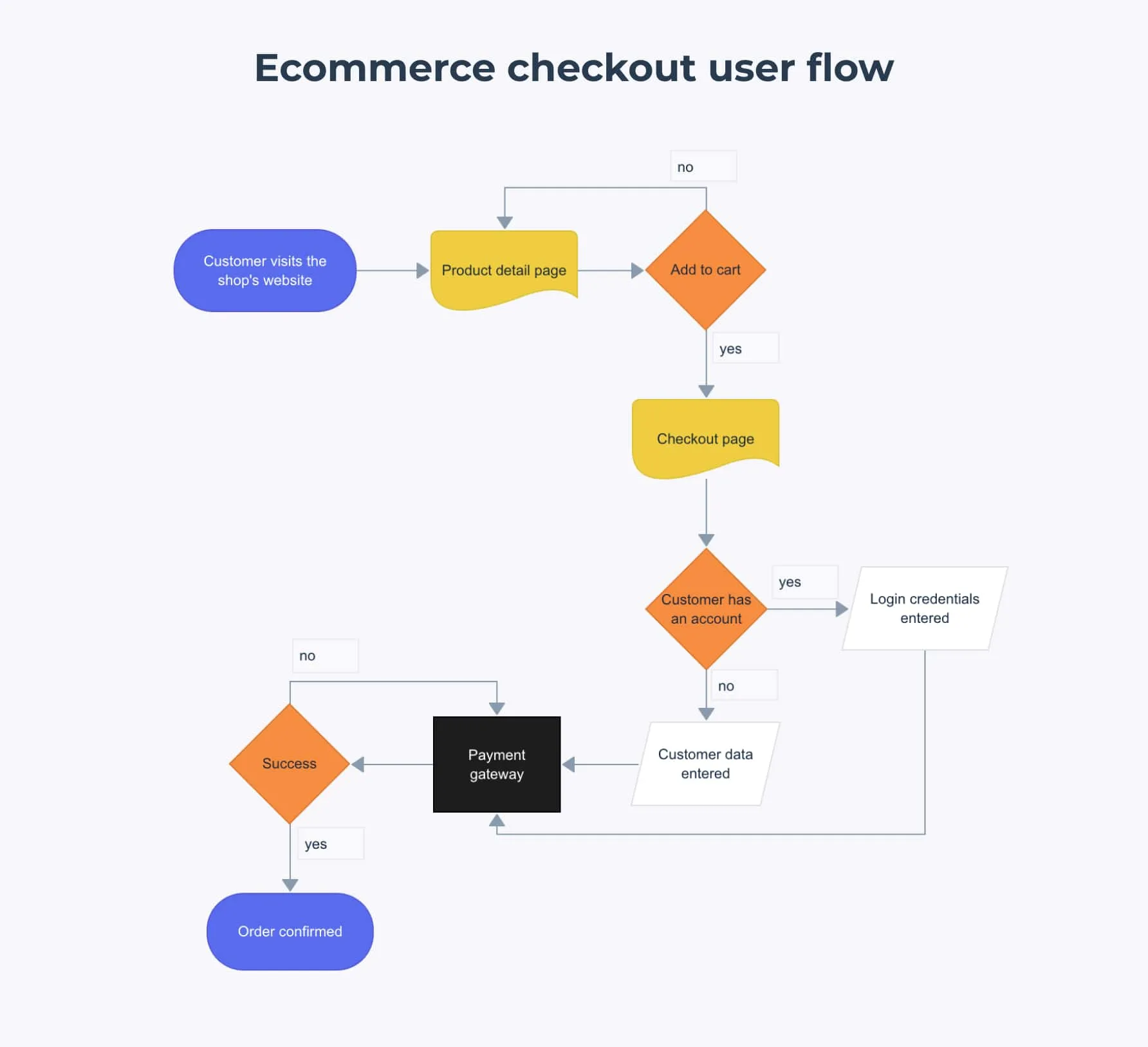
This Ecommerce Checkout User Flow visually represents the steps a user takes when purchasing a product online. The flow starts when a customer visits the shop’s website and navigates to a product detail page. If they decide to add the item to the cart, they proceed to the checkout page.
At checkout, the user is asked whether they have an account:
- If they do, they log in.
- If they don’t, they enter their details manually.
Once customer details are verified, they proceed to the payment gateway. If the payment is successful, the order is confirmed. If unsuccessful, the process may need to be retried.
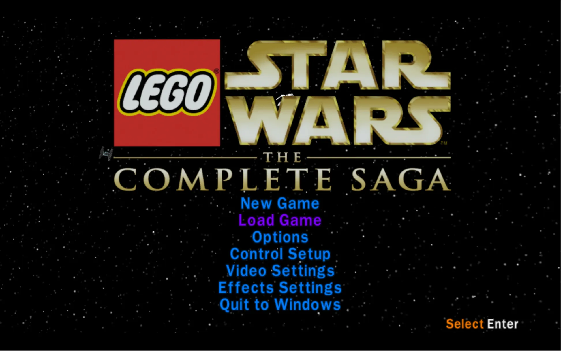
User Flow in Game Design 🎮
Let’s see how user flow applies to game design by looking at a typical level progression system in a game:
1️⃣ Menu Screen –> The player starts at the main menu, where they can navigate options like “Start Game,” “Settings,” or “Load Game.”
2️⃣ Hub Area –> Many games feature a hub world where players can explore, manage inventory, or select missions.
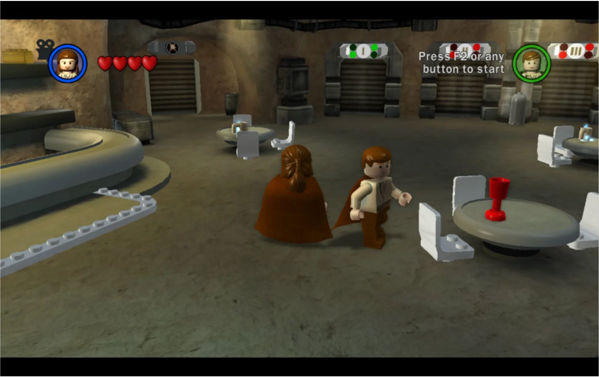
3️⃣ Select Level –> Players choose a level from a list, a map, or an interactive world.
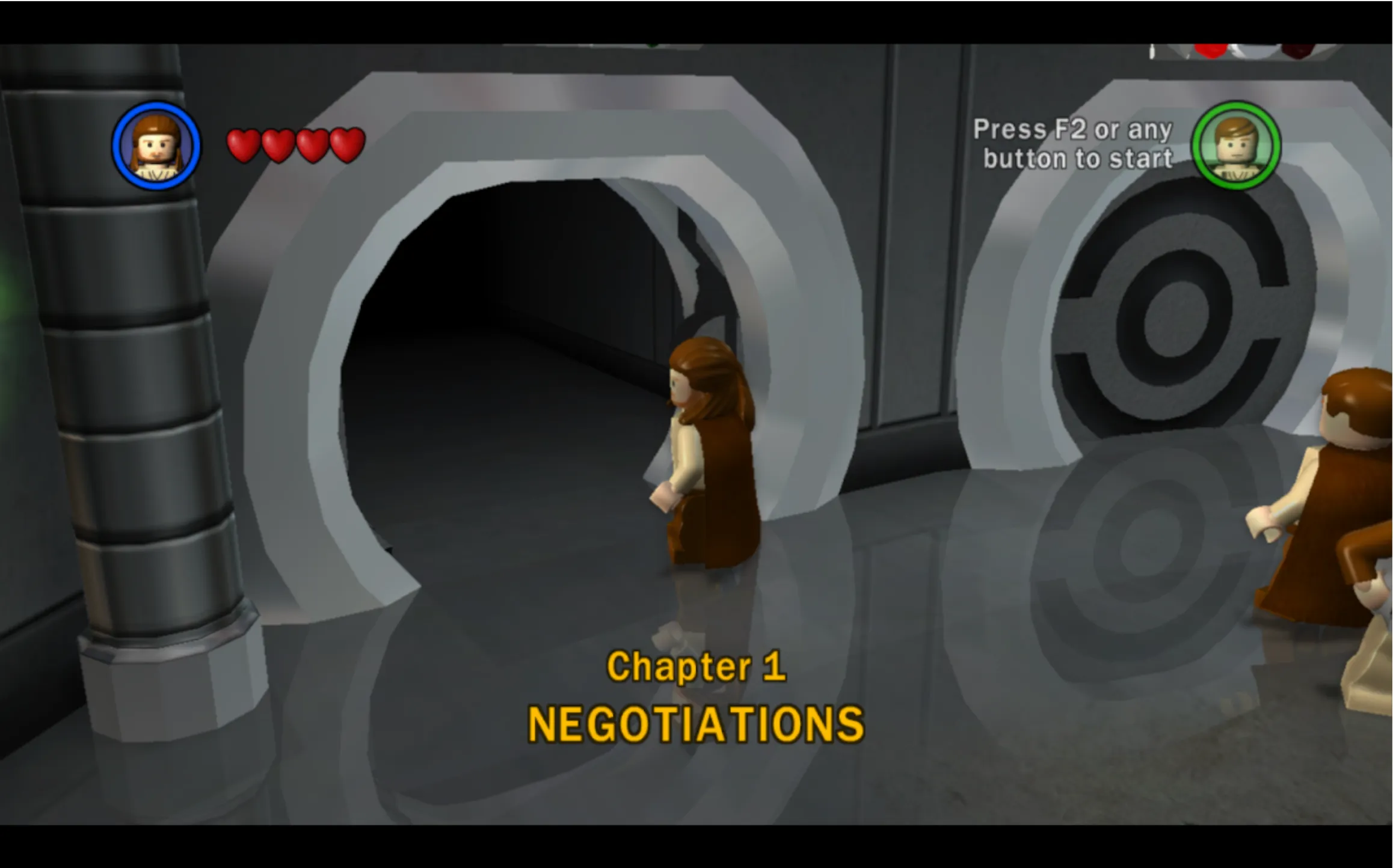
4️⃣ Watch Cutscene –> If the game has a story-driven experience, players might watch a cutscene before gameplay begins.

5️⃣ Play Level –> The player engages in the core gameplay, completing objectives or challenges.
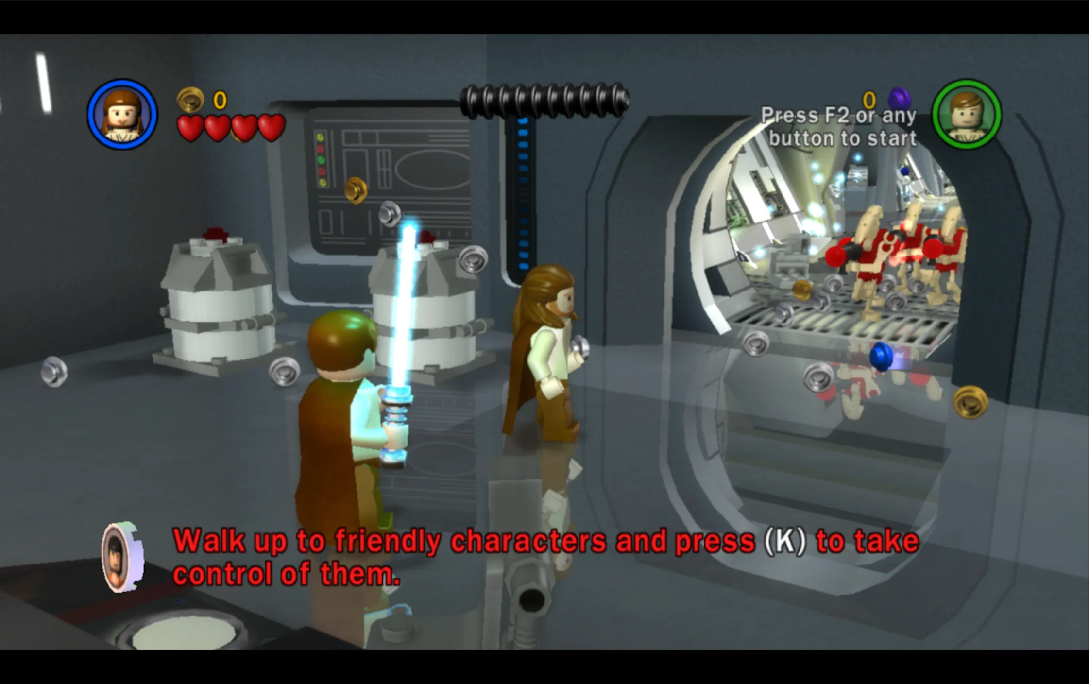
This structured approach ensures players intuitively progress through the game without confusion.
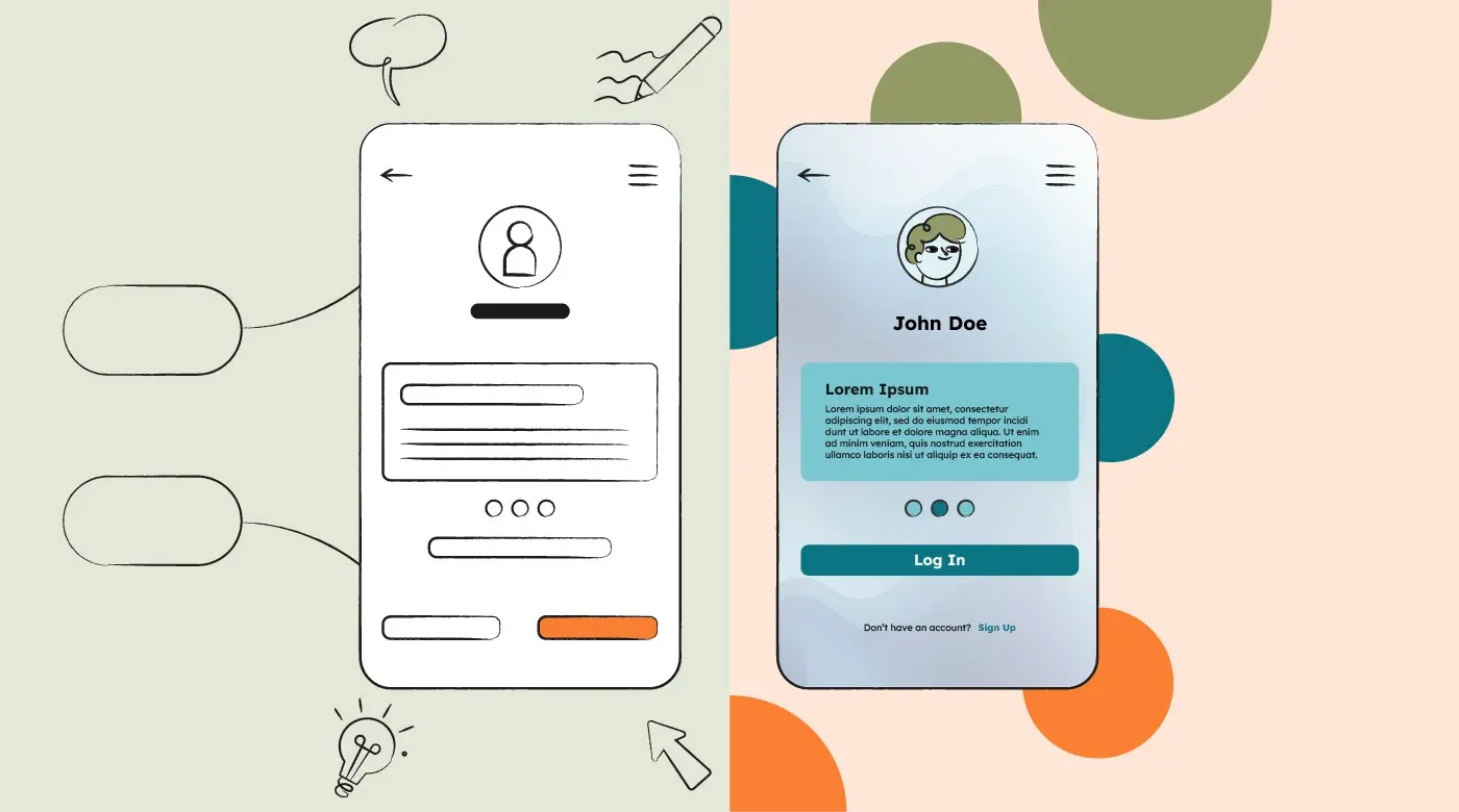
Step 2: Wireframing 📝
Once the user flow is clear, the next step is wireframing (a blueprint of your design). Each screen or page should contribute to achieving the user’s goal.
Back in the 1600s (okay, not really), wireframing was done with pen and paper. Today, tools like Balsamiq or Figma make the process digital.
Types of Wireframing
Wireframing is divided into three levels based on detail and complexity:
🔹 Low-Fidelity Wireframes: Simple sketches or digital outlines. You can even use pen and paper to start visualizing your layout. These focus on structure without detailing visuals.
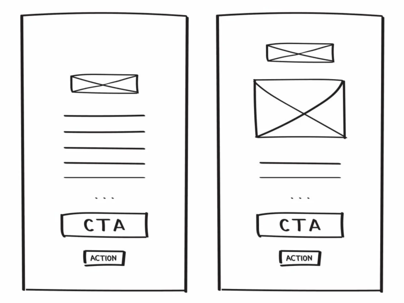
🔹 Medium-Fidelity Wireframes: More refined than low-fidelity, incorporating clearer layouts and basic UI elements. These are often done digitally but lack final design details.
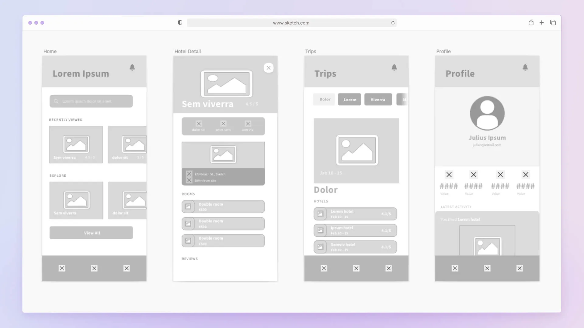
🔹 High-Fidelity Wireframes: Closer to the final design, including refined UI elements, typography, and accurate spacing. These wireframes resemble the finished product but lack full interactivity.
Step 3: Creating a Design System 🎨
This marks the beginning of UI (User Interface) design, where we bring visual consistency to the project. A design system ensures that colors, fonts, buttons, and icons are uniform across the product.
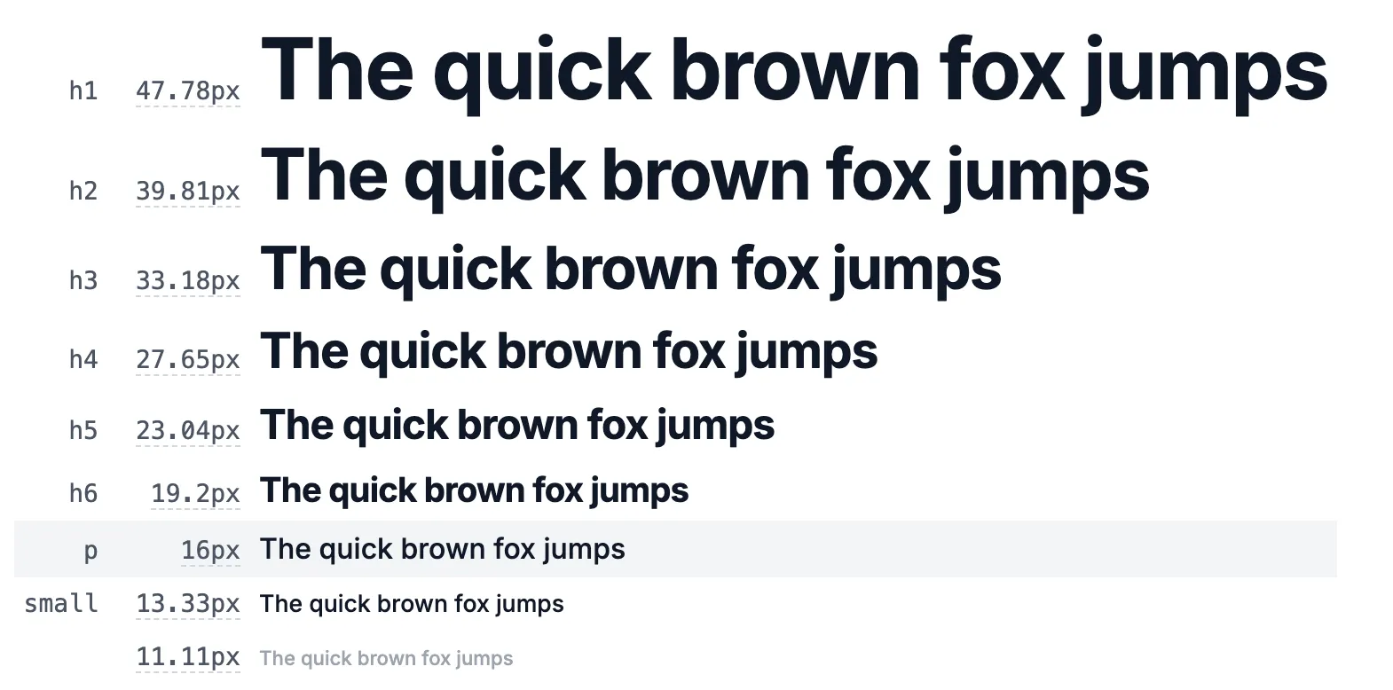
Color & Typography
Fonts define the tone of your design. Want something formal? Elegant? Playful? Try out fonts from Google Fonts and use tools like Type Scale to set readable text sizes.
Color schemes should align with brand identity or project goals. Dark mode? Minimalist? Vibrant? Use contrast and accessibility checks to make sure users can read text clearly. Use tools like colorhunt to find cool color palletes!
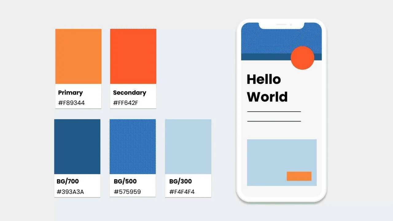
Primary, Secondary & Accent Colors
- Primary Color –> The main color of the design, often used for branding, key UI elements, and major CTAs (Call-To-Action buttons).
- Secondary Color –> A supporting color used for contrast or differentiation, such as secondary buttons or highlights.
- Accent Color –> Used sparingly for emphasis, alerts, or attention-grabbing elements.
Contrast & Typography
Contrast plays a critical role in readability and accessibility.
- High contrast (e.g., dark text on a light background) improves readability and accessibility.
- Low contrast can be used for subtle UI elements but should never compromise legibility.
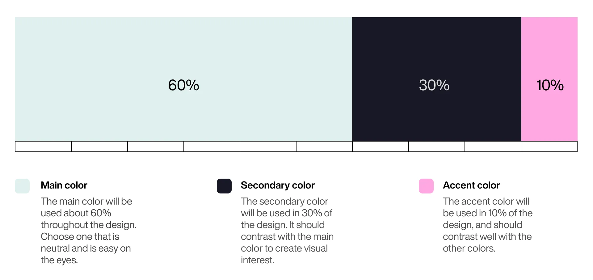
Applying Color in UI
✅ 60-30-10 Rule:
Activity: Realtime Colors 🖌️
A great tool to experiment with color palettes, contrast, and real-time UI updates is Realtime Colors.
☐ Test different primary, secondary, and accent colors in a live UI.
☐ Check contrast & readability to ensure accessibility.
☐ See instant previews of how your colors affect the overall design.
Step 4: The Actual UI Design 🎨🔥
Now that you have your building blocks, it’s time to design! Keep these six key UI/UX principles in mind:
1️⃣ Visual Hierarchy –> Prioritize important elements.
2️⃣ Contrast –> Make text readable.
3️⃣ Balance –> Space elements evenly.
4️⃣ Consistency –> Keep styles uniform.
5️⃣ Simplicity –> Avoid unnecessary clutter.
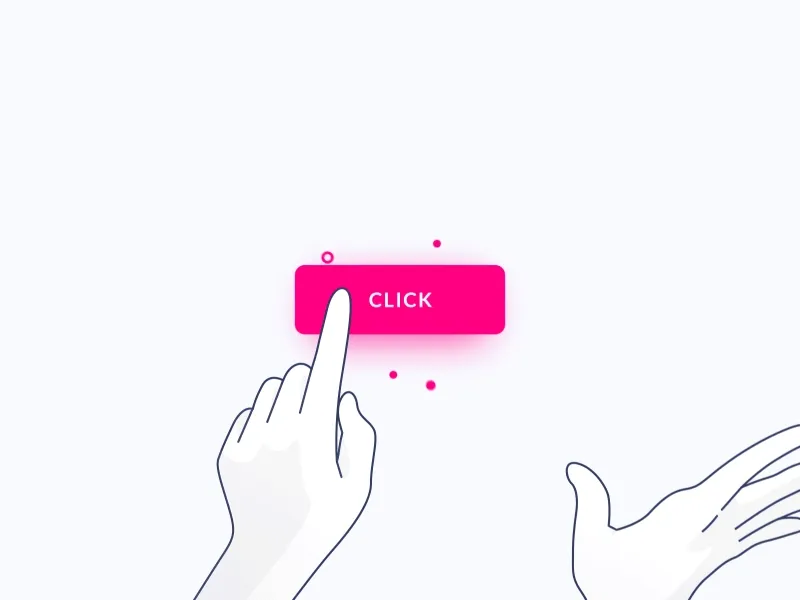
6️⃣ Interaction Feedback – Show responses to user actions.
Prototyping & Testing
UI design isn’t just assembling elements—it’s about testing, iterating, and refining the design. Prototyping in Figma or Adobe XD helps visualize user interactions before development.
Activity: Create a Homepage! 🎨
📌 Activity Instructions:
1️⃣ Use Google Slides to design a homepage layout.
2️⃣ Apply the color palette you created in Realtime Colors.
3️⃣ Incorporate UI/UX principles like visual hierarchy, contrast, and consistency.
4️⃣ Use Google Slides default fonts to keep it simple and accessible.
5️⃣ Keep in mind user experience—the layout should be intuitive and visually appealing.
Your homepage could be for:
A portfolio website (showcasing design work).
An e-commerce site (featuring a product or brand).
A tech startup (introducing a product or service).
A blog or news site (highlighting content).
A landing page for an event (conference, workshop, or course).
🔍 Finding Inspiration
Not sure where to start? Look for real-world examples and designs at:
👉 Dribbble
👉 Pinterest
💡 Use keywords like:
🔹 UI/UX
🔹 Website design
🔹 Website color palette
Final Thoughts
Great UI/UX design isn’t about making things look pretty—it’s about guiding users effortlessly through an experience. From mapping out user journeys to fine-tuning colors and typography, the key is designing with purpose.
🎨 Next Steps? Start experimenting! Try designing your first UI prototype in Figma, apply these principles, and refine your skills.
Post by: Artecs 2025 Team